w3schools.com 에서 소개하는 바와 같이, Flex box의 가장 큰 강점은 디자인을 float 나 position을 설정하지 않고도 유연성있는 반응형 레이아웃 구성을 할 수 있도록 해준다는게 있어요.
모던 웹브라우져에서는 거의 다 지원되는데, I.E 10에서는 지원이 잘 안되는 경우가 있다는 Naver D2 2019년 기록이 있네요. 모바일웹에서는 문제없다고 하고, 다른것들에 비해 배우기도 쉬워서, 회사에서 퍼블리싱작업할 때 이걸 사용하기도 했습니다.
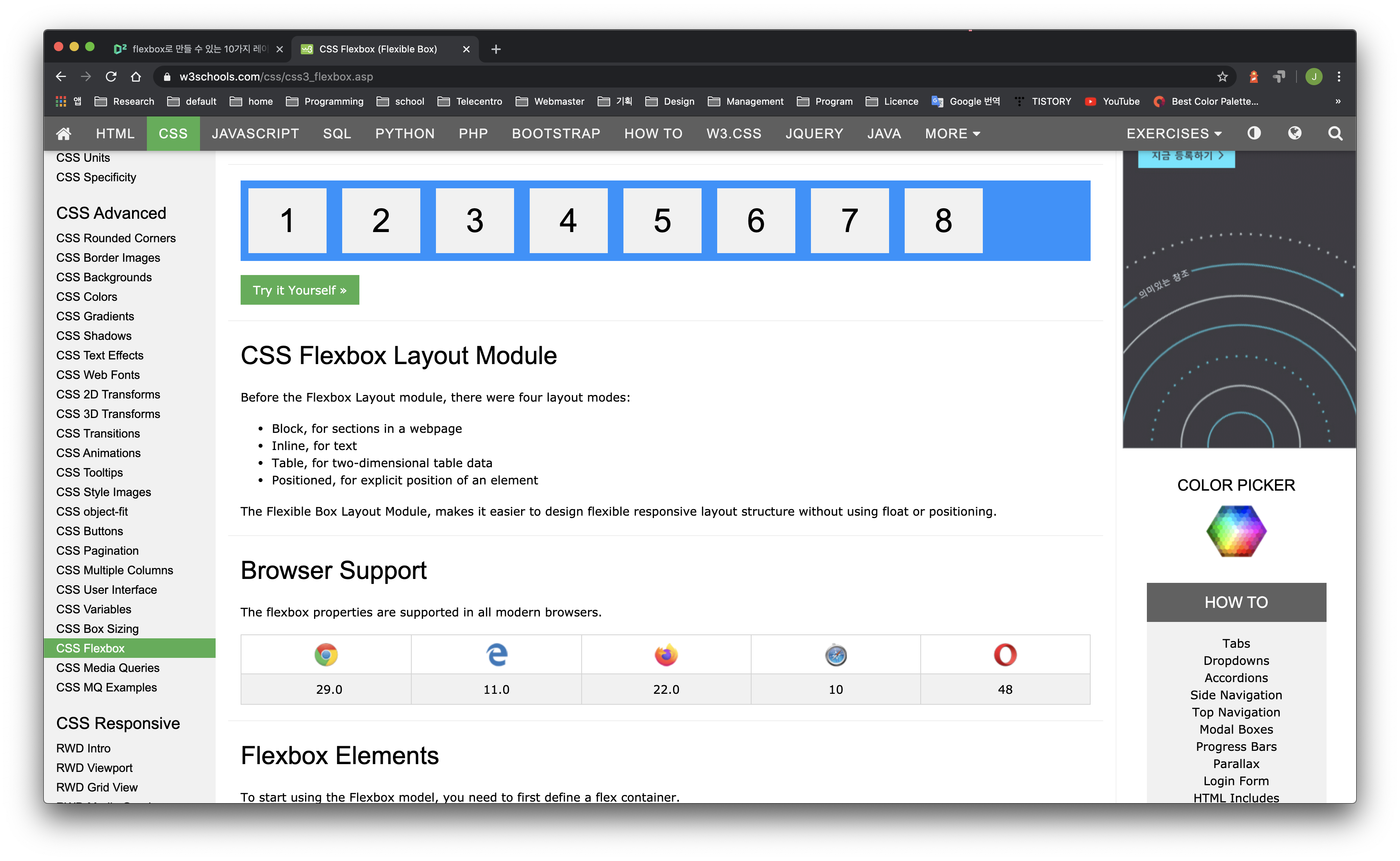
여러 사이트에서도 찾아서 예시를 볼 수 있으니 참조해보시면 좋겠습니다.
1. 편한 에디터를 열어서 index.html 을 만들어줍니다.
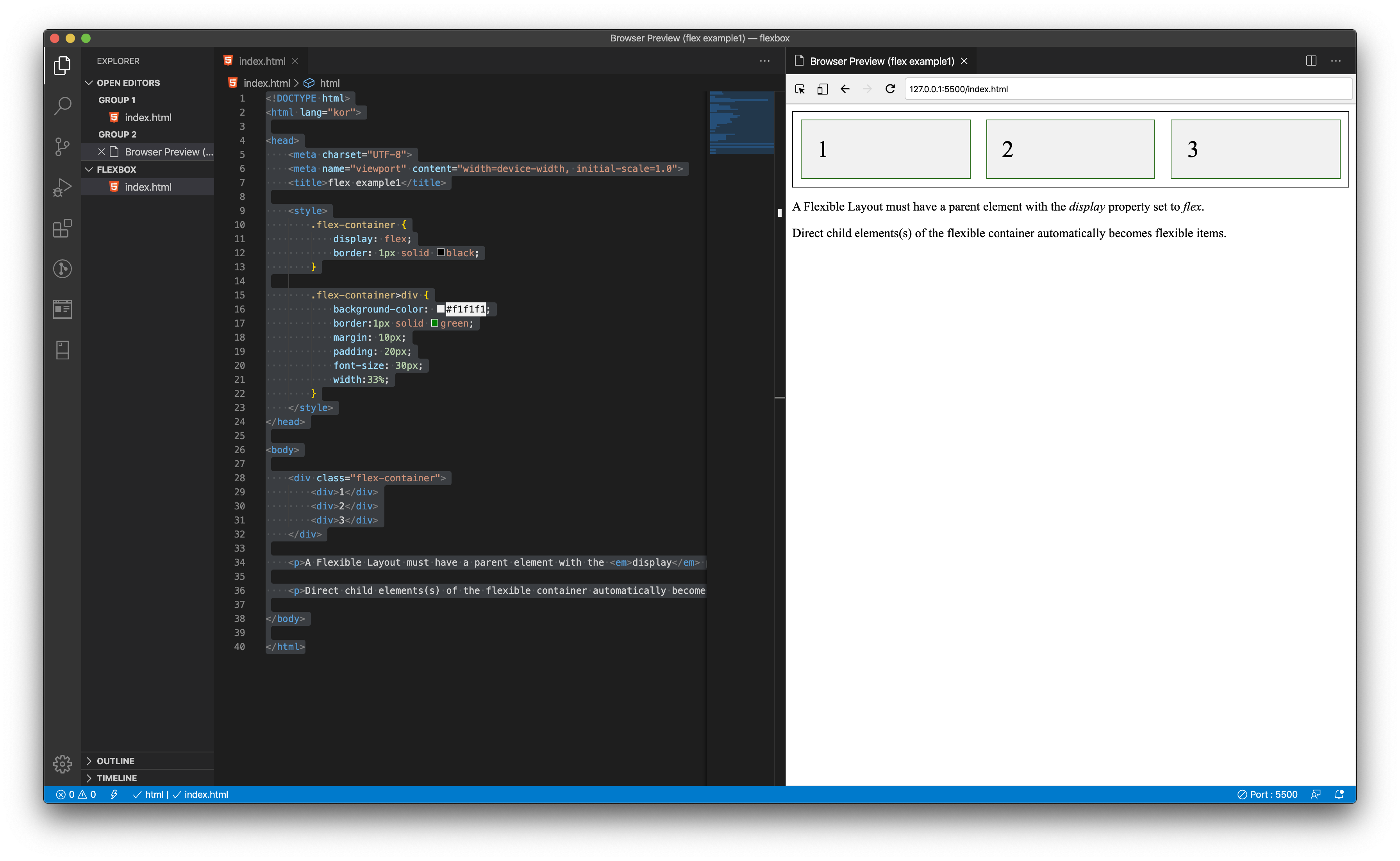
<!DOCTYPE html>
<html lang="kor">
<head>
<meta charset="UTF-8">
<meta name="viewport" content="width=device-width, initial-scale=1.0">
<title>flex example1</title>
<style>
.flex-container {
display: flex;
border: 1px solid black;
}
.flex-container>div {
background-color: #f1f1f1;
border:1px solid green;
margin: 10px;
padding: 20px;
font-size: 30px;
width:33%;
}
</style>
</head>
<body>
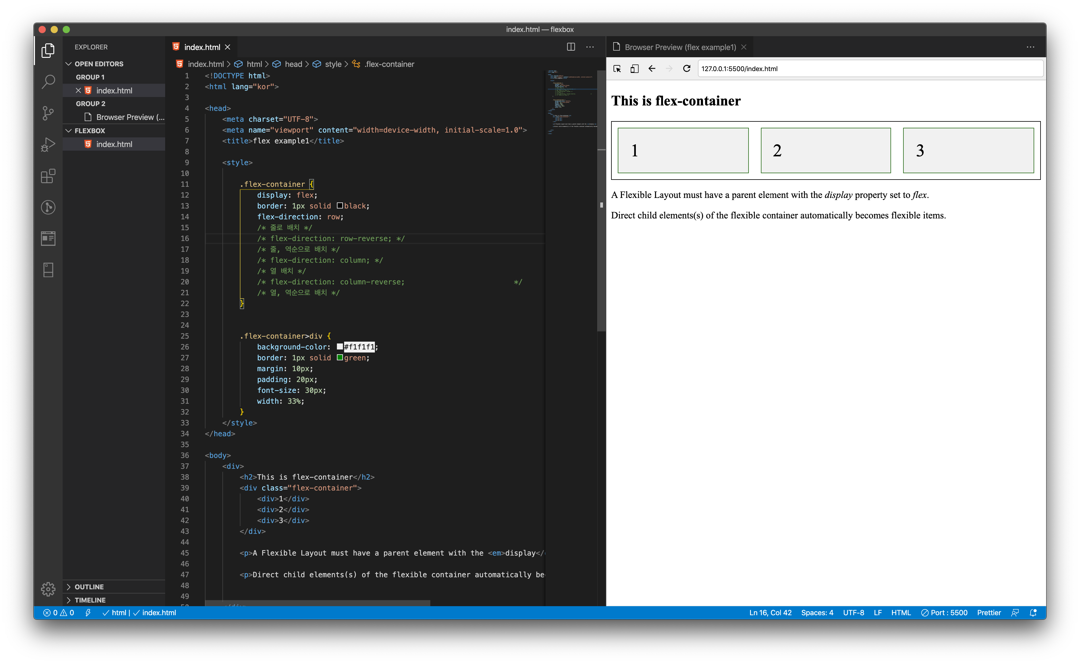
<div class="flex-container">
<div>1</div>
<div>2</div>
<div>3</div>
</div>
<p>A Flexible Layout must have a parent element with the <em>display</em> property set to <em>flex</em>.</p>
<p>Direct child elements(s) of the flexible container automatically becomes flexible items.</p>
</body>
</html>기본적인 html 구성을 주고 flex를 사용하기 위해서는
display: flex;를 써주셔야 합니다. 그리고 이후 입력하는 flex 라는 녀석의 특징을 사용하기 위해서는 flex-라는 걸 붙여주시면 돼요.
부모요소가가지고 있는 속성에는
flex-direction, flex-wrap, flex-flow, justify-content , align-items, align-content
가 있습니다. (제일 손쉬운 direction 만 살펴보고 조금 쉬었다가 이어서 나갈게요. 길어지는걸 보니 저도 불편해서.. )
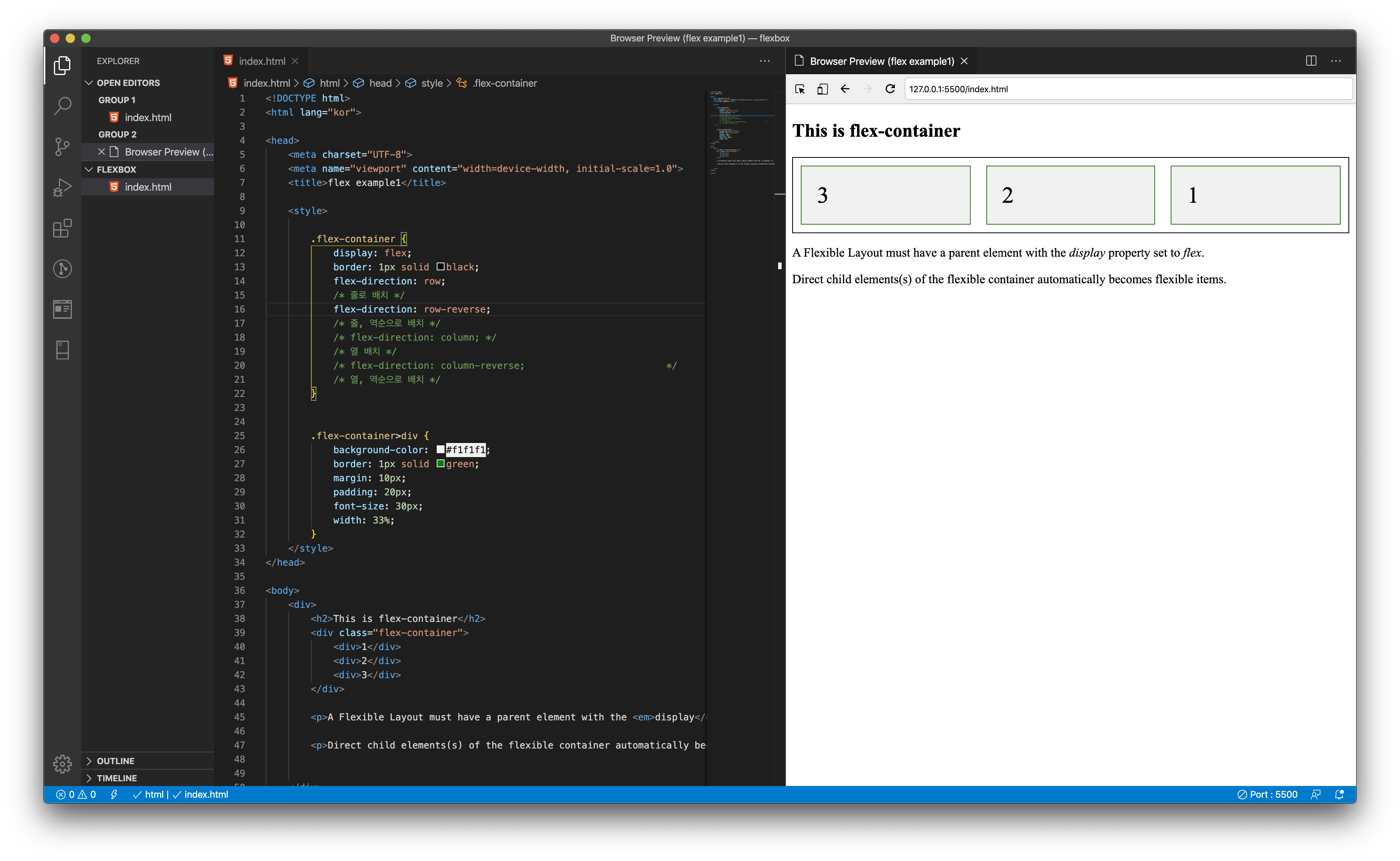
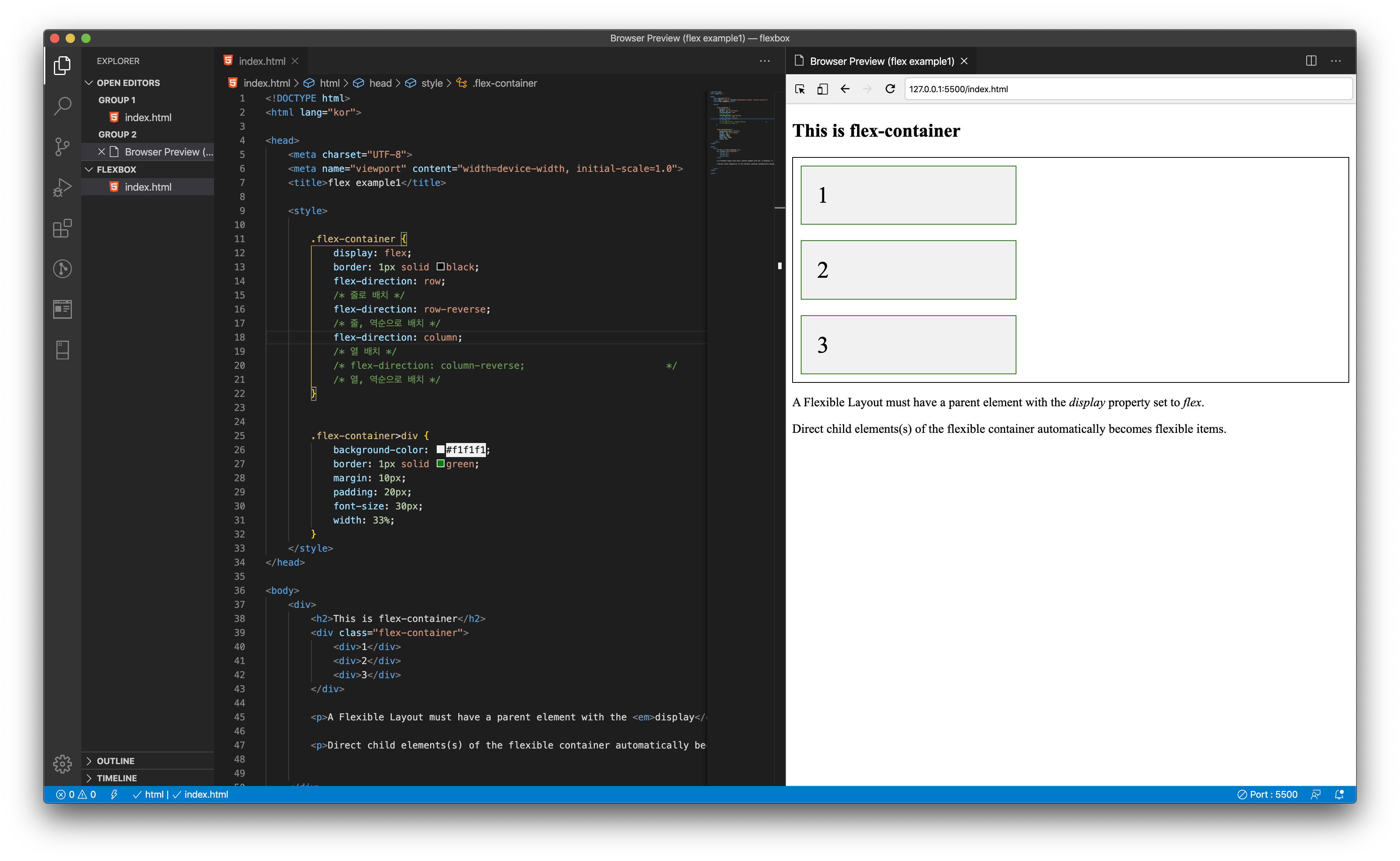
먼저 'flex-direction' 자식들의 배치를 정해주는 속성입니다.
flex-direction: row;
/* 줄로 배치 */
flex-direction: row-reverse;
/* 줄, 역순으로 배치 */
flex-direction: column;
/* 열 배치 */
flex-direction: column-reverse;
/* 열, 역순으로 배치 */